An intuitive way to guide users—step by step.
When you’re presenting content in a sequence—think onboarding flows, quizzes, product walkthroughs, or learning modules—giving users a clear visual cue of where they are can make all the difference. In this article, I’ll show you how to build a Swiper.js-powered slider with a custom step-based progress bar using just a little jQuery.
What makes this combo powerful is its balance of interactivity and clarity. Best of all? It’s super flexible and easy to extend for any kind of step-based experience.
HTML Layout: The Foundation
Let’s start with the basic structure:
 1
 2
 3
 4
 5
 6
 7
 8
 9
10
11
12
13
14
15
16
17
18
19
20
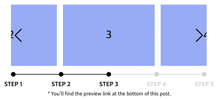
| <div class="slider">
<div class="inner">
<ul class="slide_list swiper-wrapper">
<li class="swiper-slide">1</li>
<li class="swiper-slide">2</li>
<li class="swiper-slide">3</li>
<li class="swiper-slide">4</li>
<li class="swiper-slide">5</li>
</ul>
</div>
<ul class="progress">
<li>STEP 1</li>
<li>STEP 2</li>
<li>STEP 3</li>
<li>STEP 4</li>
<li>STEP 5</li>
</ul>
<div class="swiper-button-prev"></div>
<div class="swiper-button-next"></div>
</div>
|
Quick Breakdown:
- .slider wraps everything.
- .slide_list contains the slides that Swiper cycles through.
- .progress is your custom pagination bar, synced with the steps.
- Navigation buttons let users manually move forward or back.
CSS Styling: Make It Look Good
Here’s the core styling to get our slider and progress bar working visually:
 1
 2
 3
 4
 5
 6
 7
 8
 9
10
11
12
13
14
15
16
| .slider { --transition-duration: 0.7s; --progress-width: 0; position: relative; max-width: 640px; margin: 50px auto 0; }
.slider .inner { overflow: hidden; }
.slide_list > li { display: flex; justify-content: center; align-items: center; width: 300px; height: 200px; margin: 0 10px; background: #8ab4f8; font-size: 36px; font-weight: 500; }
.swiper-button-next,
.swiper-button-prev { color: #000; top: calc(50% - 17px); }
.progress { display: flex; justify-content: space-between; position: relative; bottom: auto !important; height: 15px; margin: 20px auto 0; }
.progress::before { content: ''; position: absolute; top: 50%; left: 0; width: 100%; height: 2px; background: #D3D3D3; z-index: 0; transform: translate(0, -50%); }
.progress::after { content: ''; position: absolute; top: 50%; left: 0; width: var(--progress-width); height: 2px; background: #000; z-index: 1; transform: translate(0, -50%); transition: all var(--transition-duration); }
.progress > li { position: relative; width: auto; height: auto; margin: 0 !important; background: none; text-align: center; opacity: 1 !important; }
.progress > li .dots { display: flex; justify-content: center; align-items: center; position: relative; z-index: 2; }
.progress > li .dots::before { content: ''; display: block; width: 15px; height: 15px; background: #D3D3D3; border-radius: 50%; z-index: 2; transition: all var(--transition-duration); }
.progress > li.end .dots::before { background: #000; }
.progress > li.swiper-pagination-bullet-active .dots::before { background: #000; }
.progress > li .txt { position: absolute; top: calc(100% + 16px); left: 50%; font-size: 20px; font-weight: 700; line-height: 1; color: #D3D3D3; white-space: nowrap; transform: translate(-50%, 0); transition: all var(--transition-duration); }
.progress > li.end .txt { color: #000; }
.progress > li.swiper-pagination-bullet-active .txt { color: #000; }
|
💡 Tip: You can easily enhance this progress bar by animating transitions or using icons instead of step numbers.
JavaScript: Making It Work with Swiper + jQuery
Now let’s wire it all up:
  1
  2
  3
  4
  5
  6
  7
  8
  9
 10
 11
 12
 13
 14
 15
 16
 17
 18
 19
 20
 21
 22
 23
 24
 25
 26
 27
 28
 29
 30
 31
 32
 33
 34
 35
 36
 37
 38
 39
 40
 41
 42
 43
 44
 45
 46
 47
 48
 49
 50
 51
 52
 53
 54
 55
 56
 57
 58
 59
 60
 61
 62
 63
 64
 65
 66
 67
 68
 69
 70
 71
 72
 73
 74
 75
 76
 77
 78
 79
 80
 81
 82
 83
 84
 85
 86
 87
 88
 89
 90
 91
 92
 93
 94
 95
 96
 97
 98
 99
100
101
102
103
104
105
106
107
108
109
110
111
112
| $(document).ready(function(){
centerSlider();
});
function centerSlider() {
const titles = []; // Store slide titles
const $sliderList = $('.slide_list'); // Slide container
const $slides = $('.slide_list > li'); // Slide items
const $progressItems = $('.progress > li'); // Progress bar steps
const originalSlideCount = $slides.length; // Original number of slides
const targetSlideCount = 5; // Target number of visible slides
// Extract step labels from the progress list
$progressItems.each((_, item) => {
titles.push($(item).text());
});
// Calculate how many clones are needed to meet the target count
const currentSlideCount = $sliderList.find('> li[data-cloned!=true]').length;
const clonesNeeded = Math.max(0, Math.ceil((targetSlideCount - currentSlideCount) / originalSlideCount));
// Clone original slides as needed
for (let i = 0; i < clonesNeeded; i++) {
$slides.each(function () {
$sliderList.append($(this).clone());
});
}
// Swiper slider configuration
const swiperOptions = {
loop: true, // Enable infinite loop
centeredSlides: true, // Center the active slide
slidesPerView: 'auto', // Automatic width per slide
autoplay: {
delay: 3000, // 3-second auto slide
},
pagination: {
el: '.progress', // Use custom progress bar
type: 'bullets',
clickable: true,
renderBullet: (index, className) => {
if (index >= originalSlideCount) return '';
return `<li class="${className}">
<span class="dots"></span>
<span class="txt">${titles[index]}</span>
</li>`;
},
},
navigation: {
nextEl: '.slider .swiper-button-next',
prevEl: '.slider .swiper-button-prev',
},
};
const swiper = new Swiper('.slider .inner', swiperOptions); // Initialize Swiper
// Update progress bar and step styles when slide changes
swiper.on('transitionStart', () => {
const currentIndex = swiper.realIndex < originalSlideCount
? swiper.realIndex
: swiper.realIndex % originalSlideCount;
// Highlight current step
$('.progress .swiper-pagination-bullet')
.removeClass('swiper-pagination-bullet-active')
.eq(currentIndex).addClass('swiper-pagination-bullet-active');
updatePreviousClasses(); // Add "end" class to completed steps
updateProgressBar(); // Update visual progress bar
});
// Handle edge case when looping past last slide
let autoplayActive = false;
swiper.on('transitionEnd', () => {
const currentIndex = swiper.realIndex;
if (currentIndex >= originalSlideCount) {
const originalIndex = currentIndex % originalSlideCount;
swiper.slideToLoop(originalIndex, 0); // Snap to correct looped slide
autoplayActive = true;
}
if (autoplayActive) {
swiper.autoplay.start(); // Resume autoplay
setTimeout(() => {
autoplayActive = false;
}, 1000);
}
});
// Add 'end' class to all completed steps
function updatePreviousClasses() {
const $activeBullet = $('.swiper-pagination-bullet-active');
$activeBullet.prevAll().addClass('end'); // Mark previous steps as done
$('.progress > li').not($activeBullet).removeClass('end'); // Reset others
}
// Update visual progress bar width
function updateProgressBar() {
const $progress = $('.progress');
const $items = $progress.find('> li');
const totalItemsCount = $items.length - 1;
let activeIndex = swiper.realIndex % originalSlideCount;
if (activeIndex >= originalSlideCount) {
activeIndex -= originalSlideCount;
}
$items.removeClass('end').slice(0, activeIndex).addClass('end');
const percentage = (activeIndex / totalItemsCount) * 100;
$progress.css('--progress-width', `${percentage}%`);
}
}
|
Personal Observations
I find that enabling centeredSlides: true makes the slider feel much smoother—especially when displaying just one slide at a time. It gives the layout a nice visual balance.
If you’re using this for forms or multi-step processes, you might want to turn off looping to avoid confusing the user.
Bonus: You could build a similar experience using Slick Carousel or even with vanilla JS + IntersectionObserver. But if you want swipe gestures and built-in pagination, Swiper is hard to beat.
Optional Enhancements
- Add floating “Next” and “Back” buttons for better mobile UX.
- Swap out the step numbers for icons or custom labels.
- Use requestAnimationFrame() for more fluid progress bar animations.
Wrapping Up — How Will You Use It?
Building a step-based slider with a visual progress indicator is a powerful way to guide users through content—whether it’s educational, promotional, or interactive.
I’ve used this setup in quizzes and onboarding flows, and it’s worked like a charm. How about you? Got a project where this could fit in? Let me know in the comments—or feel free to fork the code and make it your own.