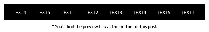
In today’s fast-moving digital world, grabbing your visitors’ attention from the moment they land on your site is crucial. One effective way to do that? A scrolling text banner. It’s a sleek, eye-catching element that communicates updates, news, or promotions without cluttering your layout.
In this tutorial, we’ll walk through how to build a responsive, infinitely looping marquee banner using jQuery, complete with adaptive styling for all screen sizes. Let’s dive in!
Why Responsive Design Matters
With users browsing from desktops, tablets, and smartphones, responsive design is a must. A rolling banner not only enhances visual appeal but also ensures consistent user experience across devices. By making your banner adaptable, you’ll keep your content accessible and engaging—no matter where it’s viewed.
Step 1: HTML Structure
Start by setting up the basic HTML for the banner:
1
2
3
4
5
6
7
8
9
| <div class="marquee_banner">
<ul class="list">
<li>TEXT1</li>
<li>TEXT2</li>
<li>TEXT3</li>
<li>TEXT4</li>
<li>TEXT5</li>
</ul>
</div>
|
What’s Happening Here?
- The
.marquee_banner div wraps the entire marquee. - Inside it, the
.list holds your scrolling text items. - Each
<li> tag represents a single message—easy to add, update, or remove.
Step 2: CSS Styling
Now, let’s style it up:
 1
 2
 3
 4
 5
 6
 7
 8
 9
10
11
12
13
14
15
16
17
18
19
20
21
22
23
| .marquee_banner {
overflow: hidden;
display: flex;
width: 100%;
max-width: 1180px;
background: #000;
}
.marquee_banner .list {
display: flex;
}
.marquee_banner .list > li {
padding: 20px;
font-size: 18px;
color: #fff;
white-space: nowrap;
}
@keyframes marqueeRolling {
0% { transform: translateX(0); }
100% { transform: translateX(-100%); }
}
|
Style Breakdown:
overflow: hidden: Keeps the banner tidy by hiding overflowing content.white-space: nowrap: Prevents line breaks, allowing text to scroll smoothly.@keyframes: Creates the scrolling animation by shifting the text from right to left.
Step 3: Making It Responsive
Let’s ensure it looks great on any screen size using media queries:
 1
 2
 3
 4
 5
 6
 7
 8
 9
10
11
12
13
| @media (max-width: 1280px) {
.marquee_banner .list > li {
padding: 10px;
font-size: 16px;
}
}
@media (max-width: 767px) {
.marquee_banner .list > li {
padding: 5px;
font-size: 14px;
}
}
|
Why This Matters:
By adjusting padding and font size, the banner remains readable and visually balanced across devices.
Now for the fun part—bringing the marquee to life with jQuery:
 1
 2
 3
 4
 5
 6
 7
 8
 9
10
11
12
13
14
15
16
17
18
19
20
21
22
23
24
25
26
27
28
29
30
31
32
33
34
35
36
37
38
39
40
41
42
43
44
45
46
47
48
49
50
51
52
53
54
55
56
57
58
59
60
| $(document).ready(function () {
setMarqueeBanner();
});
function setMarqueeBanner() {
// ── Cache key elements ──
const $wrap = $('.marquee_banner'); // Banner wrapper (hides overflow)
const $list = $('.marquee_banner .list'); // Original <ul> list
let wrapWidth = 0; // Current width of wrapper
let listWidth = 0; // Current width of list
const displayTime = 2; // Seconds each <li> is visible
const $baseClone = $list.clone(); // Master clone for endless loop
// ── 1) After all assets finish loading ──
$(window).on('load', function () {
$wrap.append($baseClone.clone()); // Add one extra list to start
marqueeBannerAct(); // Kick‑off animation
});
// ── 2) Re‑calculate on window resize ──
$(window).on('resize', function () {
const wrapWidth = $wrap.width(); // New wrapper width
const listCount = $wrap.find('.list').length;
const listWidth = $wrap.find('.list').width();
// Skip heavy work if we still have 2× the needed width
if (listCount * listWidth > wrapWidth * 2) return;
marqueeBannerAct(); // Rebuild marquee
});
// ── Core function: build (or rebuild) scrolling lists ──
function marqueeBannerAct() {
$wrap.find('.list').css('animation', 'none'); // Reset animation
$wrap.find('.list').slice(2).remove(); // Keep only 1st two lists
wrapWidth = $wrap.width(); // Update widths
listWidth = $list.width();
const speed = listWidth / ($list.find('li').length * displayTime); // px/s
const listNeeded = Math.ceil((wrapWidth * 2) / listWidth); // How many
// Clone until we have enough lists for a seamless loop
for (let i = 2; i < listNeeded; i++) {
$wrap.append($baseClone.clone());
}
// Apply scroll animation with dynamic duration
$wrap.find('.list').css({
animation: `${listWidth / speed}s linear infinite marqueeRolling`
});
}
// ── UX bonus: pause on hover ──
$wrap.on('mouseenter', () => {
$wrap.find('.list').css('animation-play-state', 'paused');
}).on('mouseleave', () => {
$wrap.find('.list').css('animation-play-state', 'running');
});
}
|
Key Features Explained
- Infinite Looping: By cloning the list, the scroll loops seamlessly.
- Responsive Recalculation: On resize, it recalculates the scroll area to ensure smooth performance.
- User-Friendly Hover Effect: Pauses the animation on hover—perfect for users who want to read without rushing.
Bonus: Take It Further
Accessibility Tips
Add ARIA roles to improve compatibility with screen readers. For example:
1
| <div class="marquee_banner" role="marquee" aria-label="Important updates"></div>
|
Add will-change to optimize animation rendering:
1
2
3
| .marquee_banner .list {
will-change: transform;
}
|
Try Different Effects
Think vertically! With a few tweaks, you can scroll text up or down, or even fade between messages for a more subtle vibe.
Use a Library for More Control
Need advanced controls? Explore libraries like Swiper.js or Slick.js—they offer robust carousel and slider capabilities out of the box.
Final Thoughts
Creating a responsive, animated marquee banner with jQuery is a simple yet powerful way to boost engagement on your site. It’s flexible, lightweight, and easy to integrate into any project.
Got ideas for using this banner in creative ways? Drop a comment below—we’d love to hear how you’re using dynamic elements to level up your site. Happy coding! 🚀