Featured image of post Simple <details> Accordion: CSS (Optional jQuery)

Simple <details> Accordion: CSS (Optional jQuery)

Learn how to create a lightweight, accessible accordion menu using HTML <details>, CSS, and optional jQuery. A perfect guide for building fast, SEO-friendly web menus.

Looking for an easy way to create an accordion menu without heavy JavaScript libraries?
In this tutorial, you’ll learn how to build a lightweight, accessible accordion using the HTML5 <details> element, style it beautifully with CSS, and optionally enhance it with jQuery for smoother interactions.
This method is perfect for developers who want a simple, fast-loading solution for FAQs, navigation menus, and expandable sections.


What Is an Accordion Menu in Web Design?

An accordion menu is a user interface pattern that allows users to expand and collapse content sections.
Think of it like a filing cabinet: you pull open one drawer to see its contents while the others stay closed.
Accordions help improve user experience by keeping pages clean, organized, and easy to navigate — especially on mobile devices.


Why Use the <details> Element for Accordions?

The HTML5 <details> and <summary> elements provide built-in expand/collapse functionality with minimal code.
Advantages of using <details> include:

  • No JavaScript required for basic functionality
  • Accessibility-friendly by default
  • SEO benefits, since the content inside <details> is still crawlable by search engines
  • Simpler codebase compared to fully custom JavaScript accordions

However, <details> does have a few limitations that we’ll address later.


Step 1: Create a Basic Accordion Using HTML

Here’s the basic structure for a simple accordion menu:

 1
 2
 3
 4
 5
 6
 7
 8
 9
10
11
12
13
14
<div class="accordion_menu">
    <details>
        <summary>Menu 1</summary>
        <p>This is the content for Menu 1.</p>
    </details>
    <details>
        <summary>Menu 2</summary>
        <p>This is the content for Menu 2.</p>
    </details>
    <details>
        <summary>Menu 3</summary>
        <p>This is the content for Menu 3.</p>
    </details>
</div>

Each <details> block creates a clickable section that expands and collapses when users interact with it.


Step 2: Understand the Limitations of the Native <details> Element

While convenient, the native behavior of <details> has a few downsides:

  • Multiple sections can remain open simultaneously.
  • Opening and closing transitions are abrupt (no animations).
  • Default icons (like arrows) vary across browsers and can be hard to customize.

To improve the experience, we can enhance it with jQuery and CSS.


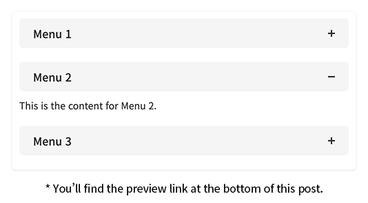
Step 3: Allow Only One Accordion Panel Open at a Time (With jQuery)

To mimic a true accordion where only one section can be open, add this jQuery script:

1
2
3
4
$('.accordion_menu summary').on('click', function() {
    const $details = $(this).parent(); // Get the clicked <details> element
    $details.siblings('details').removeAttr('open'); // Close all other open <details> elements
});

Result:
When a new section opens, all others automatically close, keeping the layout clean and easy to follow.


Step 4: Add Smooth Slide Animations to Your Accordion

Let’s add smooth sliding transitions to the accordion panels for a better user experience:

 1
 2
 3
 4
 5
 6
 7
 8
 9
10
11
12
$('.accordion_menu details').attr('open', true).each(function() {
    const $summary = $(this).find('summary'); // Find the summary inside each <details>
    
    $summary.nextAll().wrapAll('<div class="con"></div>').parent().hide(); 
    // Wrap all content after summary in a div and hide it

    $summary.on('click', function(e) {
        e.preventDefault(); // Prevent the default toggle behavior
        $(this).next('.con').slideToggle(); // Slide toggle the content div
        $(this).parent().toggleClass('open'); // Toggle "open" class for styling
    });
});

Tip:
slideToggle() animates the visibility of the section content, making interactions feel smoother and more polished.


Step 5: Combine Single-Open Behavior with Slide Animations

To create a fully functional accordion — where only one panel is open and transitions are animated — use this combined script:

 1
 2
 3
 4
 5
 6
 7
 8
 9
10
11
12
13
14
15
$('.accordion_menu details').attr('open', true).each(function() {
    const $summary = $(this).find('summary'); // Find the summary inside each <details>

    $summary.nextAll().wrapAll('<div class="con"></div>').parent().hide(); 
    // Wrap all content after summary in a hidden div

    $summary.on('click', function(e) {
        e.preventDefault(); // Prevent default toggle
        $(this).next('.con').slideToggle(); // Toggle current content

        $(this).parent().siblings().find('.con').slideUp(); // Slide up other sections
        $(this).parent().toggleClass('open'); // Add/remove "open" class to the clicked item
        $(this).parent().siblings().removeClass('open'); // Remove "open" class from other items
    });
});

This provides the cleanest UX — and makes your accordion menu behave exactly as users expect.


Step 6: Style Your Accordion Menu with CSS

Now let’s make it look great:

 1
 2
 3
 4
 5
 6
 7
 8
 9
10
11
12
13
14
15
16
17
18
19
20
21
22
23
24
25
26
27
28
29
30
31
32
33
34
35
36
37
38
39
40
41
42
43
44
45
46
47
48
49
50
51
52
53
54
55
56
57
58
59
60
61
62
63
64
65
/* Container styling for the accordion menu */
.accordion_menu {
    width: 500px;
    margin: 0 auto;
    padding-bottom: 10px;
    background-color: #fff;
    border: 1px solid #f8f8f8;
    border-radius: 6px;
    box-shadow: 0 1px 2px rgba(0, 0, 0, 0.1);
}

/* Add padding inside each <details> */
.accordion_menu details {
    display: block;
    padding: 10px;
}

/* Style for the clickable summary header */
.accordion_menu details summary {
    position: relative;
    padding: 10px 50px 10px 20px;
    background-color: #f5f5f5;
    border-radius: 6px;
    font-size: 16px;
    font-weight: 500;
    color: #333;
    cursor: pointer;
    list-style-type: none;
}

/* Hide the default browser arrow icon */
.accordion_menu details > summary::-webkit-details-marker {
    display: none;
}

/* Custom icon lines for the accordion toggle */
.accordion_menu details summary::before,
.accordion_menu details summary::after {
    content: '';
    position: absolute;
    top: 50%;
    right: 20px;
    width: 10px;
    height: 2px;
    background: #333;
    transform: translate(0, -50%);
    transition: all 0.3s;
}

/* Second line to form a plus icon (closed state) */
.accordion_menu details summary::after {
    transform: rotate(90deg);
}

/* Rotate the second line to form a minus icon (open state) */
.accordion_menu details.open summary::after {
    transform: rotate(0);
}

/* Style for the content inside the accordion panel */
.accordion_menu details p {
    margin-top: 10px;
    font-size: 14px;
    color: #333;
}

Bonus:
The custom arrow icon rotates smoothly to indicate open/close states.


Step 7: Build a Pure HTML/CSS Accordion Without jQuery

Want an even lighter setup?
You can achieve open/close visual cues purely with CSS by targeting the [open] attribute:

1
2
3
4
/* Rotate the custom arrow when the <details> is open */
.accordion_menu details[open] summary::after {
    transform: rotate(0deg);
}

This approach keeps your accordion JavaScript-free while still delivering a good user experience.


Best Practices for Creating Accessible Accordions

  • Ensure keyboard accessibility (tabbing, enter key toggling).
  • Use semantic HTML like <details> and <summary>.
  • Lazy-load heavy content inside accordion panels for faster page performance.
  • Test across different browsers to handle minor rendering differences.

Conclusion: Build a Fast, Accessible Accordion Menu with HTML5 <details>

By using HTML5’s native <details> element, styled with CSS and optionally enhanced with jQuery, you can create a fast, lightweight, and accessible accordion menu for your website.
Whether you’re building an FAQ page, navigation panel, or content toggles, this technique offers a perfect balance between simplicity and functionality.

If you found this tutorial helpful or have your own accordion customization tips, feel free to share them in the comments!


Licensed under CC BY-NC-SA 4.0
comments powered by Disqus
Hugo로 만듦
JimmyStack 테마 사용 중