Have you ever wanted to showcase multiple pieces of content in a slider that not only adapts seamlessly to different screen sizes but also loops endlessly?
For instance, an online store might want to feature a product list, or a portfolio might aim to effectively showcase its work. In this post, we’ll dive into how to implement a responsive grid slider using jQuery and the Swiper library.
HTML Structure
 1
 2
 3
 4
 5
 6
 7
 8
 9
10
11
12
13
14
15
16
17
18
19
20
21
| <div class="slider">
<div class="viewport">
<div class="swiper-wrapper">
<div class="item">1</div>
<div class="item">2</div>
<div class="item">3</div>
<div class="item">4</div>
<div class="item">5</div>
<div class="item">6</div>
<div class="item">7</div>
<div class="item">8</div>
<div class="item">9</div>
<div class="item">10</div>
<div class="item">11</div>
<div class="item">12</div>
</div>
</div>
<div class="swiper-prev">Previous</div>
<div class="swiper-next">Next</div>
<div class="swiper-pagination"></div>
</div>
|
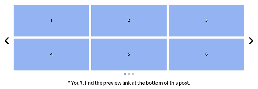
Basic Slider Structure
The .slider class wraps the entire component, while the .viewport contains the actual sliding content. Inside the viewport, the .swiper-wrapper class is placed, which is recognized by the Swiper library.
Slide Items
Each item in the slide uses the .item class. In this example, we’ve created 12 items, numbered 1 to 12.
Navigation and Pagination
The .swiper-prev and .swiper-next are the slider navigation buttons, and the .swiper-pagination indicates the current slide position. These elements are automatically handled by the Swiper library.
CSS Styling
 1
 2
 3
 4
 5
 6
 7
 8
 9
10
11
12
13
14
| .slider { position: relative; max-width: 1180px; margin: 20px auto 0; padding: 0 50px; }
.slider .viewport { overflow: hidden; }
.slider .swiper-slide { display: grid; gap:10px; grid-template-columns: repeat(3, 2fr); }
.slider .item { width: 100%; height: 150px; background: #8ab4f8; font-size: 20px; line-height: 150px; text-align: center; }
.slider .swiper-prev, .slider .swiper-next { position: absolute; top: 50%; width: 35px; height: 35px; background:url('images/arrow.png') center center no-repeat; background-size: cover; font-size: 0; text-indent: -999em; cursor: pointer; }
.slider .swiper-prev { left: 0; transform: rotateY(180deg) translate(0,-50%); }
.slider .swiper-next { right:0; transform: translate(0,-50%); }
.slider .swiper-pagination { display: flex; justify-content: center; position: relative; width: 100%; margin-top: 20px; }
.slider .swiper-pagination-bullet { width: 10px; height: 10px; margin: 0 5px; background: #ccc; opacity: 1; }
.slider .swiper-pagination-bullet-active { background: #8ab4f8; }
@media (max-width: 767px){
.slider .swiper-slide { grid-template-columns: repeat(3, 1fr); }
}
|
Slider Layout
The .slider is centered on the screen with a maximum width and margin settings. Padding is added to accommodate navigation buttons.
Grid Layout
The .swiper-slide uses CSS grid to arrange 6 items in a 3x2 format within a slide. The gap property sets the spacing between items.
Item Styling
Each .item has a fixed height and background color, with text centered.
Navigation Buttons
The previous/next buttons are positioned absolutely on the sides of the slider. The previous button’s arrow image is rotated with rotateY to point in the opposite direction.
Pagination
Pagination is centered using flex, with styles defined for each bullet and the active state.
Responsive Handling
For mobile screens (767px and below), the grid column width is adjusted to ensure three items remain visible on narrower screens.
jQuery Code
  1
  2
  3
  4
  5
  6
  7
  8
  9
 10
 11
 12
 13
 14
 15
 16
 17
 18
 19
 20
 21
 22
 23
 24
 25
 26
 27
 28
 29
 30
 31
 32
 33
 34
 35
 36
 37
 38
 39
 40
 41
 42
 43
 44
 45
 46
 47
 48
 49
 50
 51
 52
 53
 54
 55
 56
 57
 58
 59
 60
 61
 62
 63
 64
 65
 66
 67
 68
 69
 70
 71
 72
 73
 74
 75
 76
 77
 78
 79
 80
 81
 82
 83
 84
 85
 86
 87
 88
 89
 90
 91
 92
 93
 94
 95
 96
 97
 98
 99
100
101
102
103
104
105
106
107
108
109
110
111
112
113
114
115
116
117
118
119
120
121
122
123
124
| function slideAct() {
// Select slider elements
const $sliders = $(".slider");
// Responsive settings
const config = {
breakpoints: [
{ name: 'desktop', width: 768, itemsPerView: 6 }, // PC: 6 items per view
{ name: 'mobile', width: 0, itemsPerView: 3 } // Mobile: 3 items per view
]
};
// Slider state management
const state = {
swipers: [], // Swiper instances
originalItems: [], // Original items
slideIndexes: [], // Slide positions
deviceMode: '' // Current device mode
};
// Initialize sliders
function initSliders() {
$sliders.each(function(index) {
state.slideIndexes[index] = 0;
// Save original items
if (!state.originalItems[index]) {
state.originalItems[index] = $(this).find('.item').clone();
}
});
}
// Return current device mode
function getDeviceMode(windowWidth) {
const breakpoint = config.breakpoints.find(bp => windowWidth >= bp.width);
return breakpoint ? breakpoint.name : config.breakpoints[config.breakpoints.length - 1].name;
}
// Reconfigure sliders on window resize
$(window).on('resize', function() {
const newDeviceMode = getDeviceMode(window.innerWidth);
if (state.deviceMode !== newDeviceMode) {
state.deviceMode = newDeviceMode;
arrangeSlides();
}
});
// Rearrange slides
function arrangeSlides() {
// Calculate number of items per view for current mode
const breakpoint = config.breakpoints.find(bp => bp.name === state.deviceMode);
const itemsPerView = breakpoint ? breakpoint.itemsPerView : config.breakpoints[0].itemsPerView;
// Reset existing slides
$sliders.find('.item').parent('.swiper-slide').each(function() {
$(this).find('.item').unwrap();
});
$sliders.find('.swiper-slide-duplicate').remove();
// Recreate slides
$sliders.each(function(index) {
const $currentSlider = $(this).addClass(`slider-${index}`);
const $wrapper = $currentSlider.find('.swiper-wrapper');
$wrapper.empty();
// Clone original items and create slides
const $items = state.originalItems[index].clone();
const itemCount = $items.length;
for (let i = 0; i < itemCount; i += itemsPerView) {
const $slide = $('<div class="swiper-slide"></div>');
$items.slice(i, i + itemsPerView).clone().appendTo($slide);
$wrapper.append($slide);
}
// Initialize swiper after processing last slider
if (index === $sliders.length - 1) {
initSwipers(itemsPerView);
}
});
}
// Create Swiper instances
function initSwipers(itemsPerView) {
$sliders.each(function(index) {
const $currentSlider = $(this);
// Destroy existing swiper
if (state.swipers[index]) {
state.swipers[index].destroy(true, true);
state.swipers[index] = null;
}
// Swiper configuration
const swiperConfig = {
slidesPerView: 1,
initialSlide: Math.floor(state.slideIndexes[index] / itemsPerView),
loop: true,
navigation: {
nextEl: $currentSlider.find('.swiper-next')[0],
prevEl: $currentSlider.find('.swiper-prev')[0],
},
pagination: {
el: $currentSlider.find('.swiper-pagination')[0],
clickable: true,
renderBullet: function(index, className) {
return `<span class="${className}"></span>`;
}
},
on: {
slideChange: function() {
state.slideIndexes[index] = this.realIndex * itemsPerView;
}
}
};
// Create swiper
state.swipers[index] = new Swiper($currentSlider.find('.viewport')[0], swiperConfig);
});
}
// Initialize and execute
initSliders();
state.deviceMode = getDeviceMode(window.innerWidth);
arrangeSlides();
}
$(document).ready(function() {
slideAct();
})
|
Configuration and State Management
The config object defines responsive breakpoints, specifying how many items to display based on the screen size. The state object is used to track the current state of the slider.
Initialization Function
The initSliders function clones and saves the original items for each slider. These original items are used to create new slides when the screen size changes.
Device Mode Detection
The getDeviceMode function returns ‘desktop’ or ‘mobile’ mode based on the current window width. If the device mode changes during a resize event, the slides are reconfigured.
Rearranging Slides
The arrangeSlides function reconfigures the slides to match the current device mode. It resets existing slides and groups the original items into new slides based on the current mode.
Creating Swiper Instances
The initSwipers function creates and configures Swiper instances, utilizing features such as infinite looping, navigation, and pagination. The current slide index is saved in state when the slide changes.
Extending Responsive Settings: Adding Tablet
1
2
3
4
5
6
7
8
| // Responsive settings (adding tablet)
const config = {
breakpoints: [
{ name: 'desktop', width: 1024, itemsPerView: 6 }, // PC: 6 items per view (1024px and above)
{ name: 'tablet', width: 768, itemsPerView: 4 }, // Tablet: 4 items per view (768px to 1023px)
{ name: 'mobile', width: 0, itemsPerView: 3 } // Mobile: 3 items per view (767px and below)
]
};
|
By adding a tablet setting to the breakpoints array, you can achieve more precise responsive control for different devices. Note that the width values should be sorted from largest to smallest, as the getDeviceMode function finds the first breakpoint where the window width meets or exceeds its width value.
Practical Tips
Supporting Multiple Sliders
This code supports multiple sliders on a single page. Each slider’s state is independently stored in the state object’s array.
Various Grid Layouts
You can implement various grid layouts by modifying the CSS grid-template-columns property. For example, you can change it to a 2x3 or 4x2 grid as needed.
Conclusion
In this post, we explored how to implement a responsive grid slider using jQuery and Swiper. This code automatically adjusts the content layout based on screen size while providing infinite looping and convenient navigation. It’s particularly useful for websites that need to display multiple pieces of content in a grid format.
Was this tutorial helpful? If you have any questions or suggestions, feel free to share them in the comments below. Let’s keep building better code together!