Ever found yourself repeatedly switching between different devices to check how your website looks?
When building responsive websites, it’s essential to verify how designs render across desktop, tablet, and mobile screen sizes. While browser developer tools work well, having a standalone preview tool is much more convenient for client presentations and team collaboration. This tutorial will show you how to build your own responsive website preview tool using jQuery and iframes.
HTML Structure
Let’s start with the HTML framework that creates our device preview interface:
| |
Overall Structure
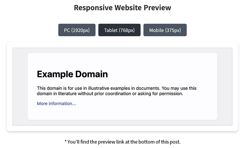
The preview tool is contained within the.responsive_viewerclass, which houses a title, device selection buttons, and an iframe for displaying website content.Device Selection Buttons
Three buttons represent different device sizes: desktop (1920px), tablet (768px), and mobile (375px). Each button has adata-deviceattribute that identifies its device type. The.mo_hiddenclass hides pixel dimensions on smaller screens.iframe Preview Area
The heart of the tool is an iframe element nested within container divs. This iframe will load and display the target website, allowing us to adjust its size dynamically.
CSS Styling
Now let’s style our preview tool with clean, functional CSS:
| |
Layout Configuration
The preview tool has a maximum width of 1200px and is centered on the page. We use flexbox for a clean, vertical layout with appropriate spacing between elements.Button Design
The device selection buttons feature a sleek dark blue gradient that changes on hover and when active. Their rounded corners and padding create comfortable, easy-to-click targets.Frame Container
The preview area uses a white background with subtle shadow effects for a clean, modern look. We use a nested container structure to separate styling concerns from functional requirements.iframe Configuration
The iframe is set to fill its container completely without borders. Thetransform-origin: 0 0property is crucial for ensuring our scaling happens from the top-left corner.Responsive Adaptation
On smaller screens (below 768px), we hide the pixel dimensions to conserve space. The iframe container’s height adjusts dynamically based on the viewport height, maintaining visibility on all devices.
jQuery Implementation
The magic of our responsive preview tool happens through jQuery:
| |
Element Caching and Initialization
We start by caching frequently accessed DOM elements to improve performance. Device widths are stored in a configuration object that’s easy to customize for different device sizes.Button Event Handling
When a button is clicked, we apply the active styling and call thesetDeviceSizefunction to update the preview. This creates an interactive experience as users switch between device views.Dynamic Size Adjustment
ThesetDeviceSizefunction sets the iframe width according to the selected device and then scales it to fit the container. We usesetTimeoutto ensure all DOM updates are complete before measuring sizes.Proportional Scaling Calculation
When a device width exceeds the container width, we calculate a scaling ratio to shrink the preview proportionally. This maintains the correct aspect ratio while fitting within the available space.Event Handling for Responsiveness
Event listeners for window resizing and iframe loading ensure the preview maintains the correct dimensions even when the browser size changes or new content loads.
Practical Use Cases
Here’s how you can leverage this responsive preview tool:
Development and Testing
Test your websites across different device sizes without constantly switching between physical devices or browser dev tools. Point the iframe to your local development server to preview changes in real-time.Client Presentations
Impress clients with an interactive way to demonstrate how their website responds to different device sizes. It’s more engaging than static screenshots and helps clients visualize the final product.Portfolio Enhancement
Add this tool to your portfolio to showcase your responsive websites. Allow visitors to interactively test your work across different screen sizes without leaving your portfolio page.
Conclusion
Building a responsive device preview tool with jQuery and iframes gives you a powerful way to visualize and test websites across multiple screen sizes. The solution is lightweight, requiring just a handful of HTML, CSS, and JavaScript code, yet provides functionality similar to browser developer tools.
This tool is particularly valuable for front-end developers, designers, and project managers who need to validate responsive designs or showcase work to clients. It’s also an excellent learning resource for understanding how CSS scaling and responsive design principles work together.
How do you currently test your responsive designs? Have you created any extensions or improvements to this basic preview tool? Share your experiences in the comments below!