The DRY Principle for Tab Menus
Have you ever found yourself copying and pasting the same tab menu code across different parts of your website? This common front-end development challenge violates one of programming’s core principles: “Don’t Repeat Yourself” (DRY).
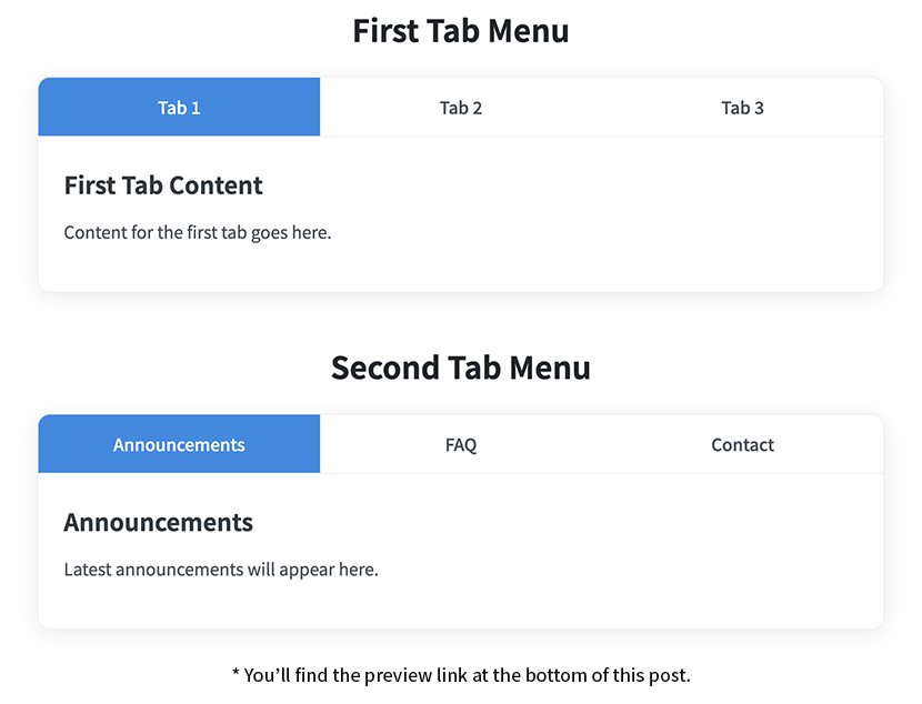
Modern websites often need multiple tab components on a single page – perhaps one for user profiles, another for product categories, and a third for content filters. Creating separate implementations for each instance not only bloats your codebase but also creates a maintenance nightmare when you need to update functionality.
In this tutorial, I’ll show you how to build a scalable tab menu system with jQuery where adding new instances requires only HTML markup – with zero additional JavaScript. Let’s create a solution that’s both elegant and practical!
Component Architecture: The HTML Foundation
Our solution starts with a consistent HTML structure that serves as the template for all tab menu instances:
| |
The Container Pattern
Each.tab_containerworks as an independent component that encapsulates all its functionality – similar to how components work in modern frameworks like React or Vue.Navigation and Content Pairing
The.tit_listelement serves as the navigation menu, with each anchor element pointing to its corresponding content block via the href attribute – creating a clear relationship between tabs and content.Content Containers
Each content panel uses the.tab_contentclass and has a unique ID that matches its navigation control. This relationship is what powers our tab switching mechanism.
The Namespace Strategy for Multiple Instances
When implementing multiple tab systems on one page, preventing ID conflicts is crucial. Our solution uses a simple but effective namespacing convention:
| |
This namespacing approach ensures that each tab content has a unique identifier and stays properly linked to its controller. Think of it as creating separate channels that allow multiple tab systems to operate independently without interference.
Visual Framework: The CSS Implementation
The visual design of our tab system combines flexbox layout, subtle shadows, and clear state indicators:
| |
Card-Based Interface
The container uses a modern card design with subtle shadows and rounded corners that create depth and visual hierarchy, making each tab component feel like a cohesive unit on your page.Flexible Navigation Bar
The navigation bar uses flexbox to create a responsive row of equally-sized tabs that adapt to content and available space – ensuring consistent proportions no matter what you name your tabs.Interactive Visual Feedback
Hover and active states provide clear visual cues to users, enhancing usability. The color transitions create a subtle but effective indication of interactivity.Content Display Logic
All content panels start hidden and are revealed only when needed. The padding ensures that tab content remains readable with comfortable spacing.
The Behavior Layer: jQuery Implementation
Here’s where the magic happens – a single initialization function that handles all tab instances on your page:
| |
The Factory Pattern
Our implementation uses jQuery’s.each()method to create what’s essentially a factory pattern. Each tab container becomes a self-contained instance with its own scope and event handlers.Efficient DOM Queries
By caching our jQuery selections within each instance’s context, we create an efficient system that minimizes DOM queries and avoids selector conflicts between different tab sets.State Management
TheactivateTabfunction serves as a state manager, handling transitions between tabs by controlling CSS classes and visibility. It acts like a mini state machine for each tab instance.Clean Event Handling
The click handler prevents default anchor behavior and triggers our controlled tab switching. This creates a smooth, application-like experience without page jumps.
Taking It Further: Extensions and Enhancements
This tab system provides a solid foundation that you can extend in many ways:
- Smooth Transitions: Add CSS transitions for fade or slide effects between tabs
- Dynamic Content Loading: Load tab content via Ajax only when a tab is activated
- URL Integration: Update the URL hash to reflect the active tab for direct linking
- Nested Tab Systems: Create hierarchical tab interfaces for complex information architecture
The beauty of this approach is that it maintains a clean separation between structure (HTML), presentation (CSS), and behavior (JavaScript) while keeping your code DRY.
Conclusion
Building reusable UI components is a fundamental skill for modern front-end development. This tab system demonstrates how thoughtful design and jQuery’s flexibility can create a solution that’s both efficient and adaptable.
By using proper scoping, consistent HTML structures, and jQuery’s powerful selector capabilities, we’ve created a pattern that works across a wide range of projects with minimal effort. The next time you need multiple tab interfaces on a page, you’ll have a robust solution ready to implement.
What other UI components have you made reusable in your projects? Have you found other ways to improve tab interfaces? Share your thoughts in the comments!