여러 개의 콘텐츠를 슬라이드 형태로 보여주고 싶은데, 화면 크기에 따라 자동으로 조절되면서 무한으로 반복되는 방법이 궁금하지 않으신가요?
웹사이트를 만들 때 여러 개의 콘텐츠를 한 번에 보여주고 싶을 때가 있습니다. 예를 들어, 쇼핑몰에서는 상품 목록을, 포트폴리오에서는 작품들을 효과적으로 전시할 수 있습니다. 이번 포스트에서는 jQuery와 Swiper 라이브러리를 활용하여 반응형 그리드 슬라이더를 구현하는 방법을 알아보겠습니다.
HTML 구조
| |
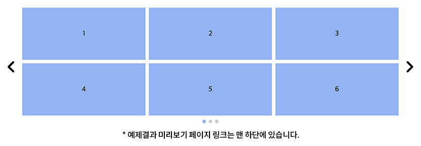
슬라이더의 기본 구조
전체 슬라이더를 감싸는.slider클래스와 실제 슬라이더가 보여지는.viewport가 있습니다.viewport내부에는 Swiper 라이브러리가 인식하는.swiper-wrapper클래스가 배치됩니다.슬라이드 아이템
.item클래스로 각 슬라이드 아이템을 구성합니다. 여기서는 1부터 12까지 총 12개의 아이템이 준비되어 있습니다.네비게이션과 페이지네이션
.swiper-prev와.swiper-next는 슬라이더 이동 버튼이며,.swiper-pagination은 현재 슬라이드 위치를 표시합니다. 이 요소들은 Swiper 라이브러리에서 자동으로 연결됩니다.
CSS 스타일
| |
슬라이더 레이아웃
.slider에는 최대 너비와 여백을 설정하여 화면 중앙에 배치됩니다. 좌우 패딩은 네비게이션 버튼을 위한 공간을 확보합니다.그리드 레이아웃
.swiper-slide는 CSS 그리드를 사용하여 한 슬라이드 내 6개의 아이템을 3x2 형태로 배치합니다.gap속성으로 아이템 간 간격을 설정합니다.아이템 스타일링
각.item은 고정 높이와 배경색을 가지며, 텍스트는 중앙 정렬됩니다.네비게이션 버튼
이전/다음 버튼은 슬라이더 좌우에 절대 위치로 배치됩니다. 이전 버튼은 화살표 이미지를rotateY로 회전시켜 반대 방향을 가리키도록 합니다.페이지네이션
페이지네이션은flex로 중앙 정렬되며, 각bullet의 스타일과active상태 스타일을 정의합니다.반응형 처리
모바일 화면(767px 이하)에서는 그리드 컬럼 너비를 조정하여 더 좁은 화면에서도 3개의 아이템이 잘 보이도록 만듭니다.
jQuery 코드
| |
설정 및 상태 관리
config객체는 반응형 브레이크포인트와 각 화면 크기별 표시할 아이템 수를 정의합니다.state객체는 슬라이더의 현재 상태를 추적하는 데 사용됩니다.초기화 함수
initSliders함수는 각 슬라이더의 원본 아이템을 복제하여 저장합니다. 이 원본 아이템들은 화면 크기가 변경될 때 새로운 슬라이드를 생성하는 데 사용됩니다.디바이스 모드 감지
getDeviceMode함수는 현재 창 너비에 따라 ‘desktop’이나 ‘mobile’ 모드를 반환합니다.resize이벤트에서 디바이스 모드가 변경되면 슬라이드를 재구성합니다.슬라이드 재구성
arrangeSlides함수는 현재 디바이스 모드에 맞게 슬라이드를 다시 구성합니다. 기존 슬라이드를 초기화하고, 원본 아이템들을 현재 모드에 맞는 개수로 그룹화하여 새 슬라이드를 생성합니다.Swiper 인스턴스 생성
initSwipers함수는 Swiper 인스턴스를 생성하고 설정합니다. 무한 루프, 네비게이션, 페이지네이션 등 Swiper의 다양한 기능을 활용합니다. 슬라이드 변경 시 현재 슬라이드 인덱스를state에 저장합니다.
반응형 설정 확장하기: 태블릿 추가하기
| |
위 코드처럼 breakpoints 배열에 태블릿 설정을 추가하면 디바이스별로 더 세밀한 반응형 제어가 가능합니다. 여기서 주의할 점은 width 값을 큰 것부터 작은 순서로 정렬해야 합니다. getDeviceMode 함수는 창 너비가 설정된 width 이상인 첫 번째 breakpoint를 찾기 때문입니다.
실제 활용 팁
여러 슬라이더 지원
이 코드는 페이지 내 여러 슬라이더를 동시에 지원합니다. 각 슬라이더의 상태는state객체의 배열에 독립적으로 저장됩니다.다양한 그리드 레이아웃
CSS의grid-template-columns속성을 수정하여 다양한 그리드 레이아웃을 구현할 수 있습니다. 예를 들어, 2x3 그리드나 4x2 그리드 등 원하는 형태로 변경 가능합니다.
결론
이번 포스트에서는 jQuery와 Swiper를 활용한 반응형 그리드 슬라이더 구현 방법을 알아보았습니다. 이 코드는 화면 크기에 따라 자동으로 콘텐츠 레이아웃을 조정하면서도 무한 루프와 편리한 네비게이션을 제공합니다. 특히 여러 개의 콘텐츠를 그리드 형태로 보여주어야 하는 웹사이트에서 유용하게 활용할 수 있습니다.
이 포스트가 도움이 되셨나요? 더 궁금한 점이나 의견이 있다면 댓글로 남겨주세요. 함께 더 나은 코드를 만들어 나가요!