웹사이트를 만들다 보면 레이어 팝업 구현은 피할 수 없는 기능 중 하나죠. 그런데 팝업이 떠있는 상태에서 모바일로 스크롤을 하다 보면, 팝업 뒤의 배경 화면까지 같이 움직여서 사용자가 혼란스러워하는 경험, 다들 해보셨을 거예요.
저도 처음 웹 개발을 시작했을 때는 이 문제를 overflow: hidden으로만 해결하려고 했는데, 정작 팝업 내부에서는 스크롤이 필요한 상황이 생기더라고요. 특히 긴 약관이나 상품 설명이 들어가는 팝업에서는 내부 스크롤은 유지하면서 배경 스크롤만 막아야 하는 딜레마가 있었죠. 그때 발견한 게 바로 overscroll-behavior 속성이었어요.
이 글에서는 overscroll-behavior와 jQuery를 활용해서 팝업 안에서만 스크롤 되고, 배경 스크롤은 완벽하게 제어하는 방법을 알려드릴게요. 기본 구현부터 모바일 터치 제어까지, 실제 프로젝트에서 바로 사용할 수 있는 완성도 높은 팝업 시스템을 만들어보겠습니다.
팝업 스크롤 문제가 생기는 이유
팝업에서 스크롤 문제가 생기는 건 브라우저의 기본 동작 때문이에요. 사용자가 팝업 내부에서 스크롤을 끝까지 하고 나면, 그 스크롤 이벤트가 부모 요소(보통 body)로 전파되는 거죠.
실제 프로젝트에서는 이런 상황들이 자주 발생해요.
- 이용약관 팝업에서 내용을 다 읽고 더 스크롤 하려고 할 때
- 상품 상세 정보 팝업에서 긴 설명을 보다가 배경이 움직이는 경우
- 모바일에서 팝업 내부를 스와이프했는데 뒤쪽 페이지가 같이 움직이는 현상
overscroll-behavior 속성 완벽 이해하기
overscroll-behavior는 CSS에서 스크롤 체이닝(scroll chaining)을 제어하는 속성이에요. 쉽게 말해서, 한 요소에서 스크롤이 끝났을 때 부모 요소로 스크롤 이벤트가 전달되는 걸 막거나 허용할지를 결정해요.
사용할 수 있는 값들
| |
실제 프로젝트에서는 주로 none 값을 사용해요. 이 값이 팝업 스크롤 문제를 완벽하게 해결해 줍니다.
각 값의 차이점 비교
| 값 | 스크롤 체이닝 | 오버 스크롤 효과 | 사용 시기 |
|---|---|---|---|
auto | 허용 ✅ | 허용 ✅ | 일반적인 스크롤 동작 |
contain | 차단 🚫 | 허용 ✅ | 스크롤 전파만 막고 싶을 때 |
none | 차단 🚫 | 차단 🚫 | 팝업처럼 완전히 격리하고 싶을 때 |
제가 실무에서 테스트해 본 결과, 팝업에서는 none이 가장 안정적이었어요. contain도 스크롤 전파는 막아주지만, 모바일에서 바운스 효과 같은 오버 스크롤 애니메이션이 여전히 나타날 수 있어요.
HTML 구조와 기본 설정
| |
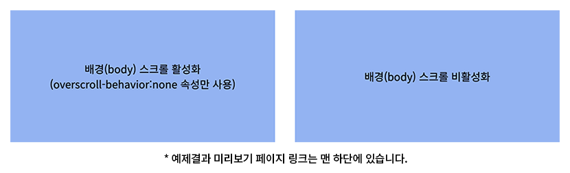
위 HTML 구조를 보시면, 팝업 트리거 역할을 하는 두 개의 버튼이 있어요. 첫 번째는 overscroll-behavior만 사용하는 버전이고, 두 번째는 배경 스크롤까지 완전히 차단하는 버전이에요.
다음으로 CSS 스타일링을 통해 어떻게 이 문제를 해결하는지 살펴보겠습니다.
CSS로 스크롤 동작 제어하기
CSS에서 팝업 스크롤을 제어하는 핵심은 두 가지 접근법을 조합하는 거예요. 하나는 overscroll-behavior로 스크롤 전파를 막는 것이고, 다른 하나는 필요에 따라 body 스크롤을 완전히 차단하는 거죠.
실제 프로젝트에서는 UX 요구사항에 따라 두 방법을 선택적으로 사용해야 해요. 예를 들어 간단한 알림 팝업이라면 첫 번째 방법으로 충분하지만, 전체 화면을 덮는 모달이라면 두 번째 방법이 더 적합해요.
| |
여기서 가장 중요한 부분은 .popup_con의 overscroll-behavior: none 속성이에요. 이 속성이 팝업 내부에서 스크롤이 끝났을 때 부모로 전파되는 걸 막아줍니다.
그리고 .disable_scroll 클래스를 주목해 보세요. touch-action: none까지 포함된 이유는 모바일에서의 터치 제스처까지 완전히 제어하기 위함이에요. 제가 모바일 최적화 프로젝트를 할 때 깨달은 건데, iOS Safari에서는 overflow: hidden만으로는 완전히 스크롤이 막히지 않더라고요.
❌ 주의할 점: overscroll-behavior를 잘못된 요소에 적용하기
| |
✅ 올바른 적용: 실제 스크롤이 일어나는 요소에 적용하기
| |
이제 jQuery로 이 CSS 클래스들을 동적으로 제어하는 방법을 알아보겠습니다.
jQuery로 팝업 동작 구현하기
jQuery 구현에서 중요한 건 팝업의 열기/닫기 상태에 따라 적절한 CSS 클래스를 추가하고 제거하는 거예요. 특히 사용자가 ESC 키를 누르거나 브라우저 뒤로 가기를 할 때도 스크롤 상태가 정상적으로 복구되어야 해요.
실제 프로젝트에서는 여러 개의 팝업이 겹쳐서 뜨는 경우도 고려해야 해요. 예를 들어 상품 상세 팝업에서 리뷰 팝업이 또 뜨는 상황 말이에요. 이때는 카운팅 방식으로 관리해야 하는데, 이 예제에서는 기본적인 단일 팝업 케이스를 다루겠습니다.
| |
코드를 자세히 보시면, 팝업을 열 때 버튼에 type_disable 클래스가 있는지 체크하고 있어요. 이렇게 하는 이유는 같은 팝업이라도 상황에 따라 다른 스크롤 정책을 적용할 수 있기 때문이에요.
제가 실제 커머스 프로젝트에서 경험한 사례를 예로 들어보면
- 상품 옵션 선택 팝업: 배경 스크롤 허용 (사용자가 다른 상품도 확인할 수 있게)
- 결제 정보 입력 팝업: 배경 스크롤 차단 (집중도를 높이고 실수 방지)
❌ 흔한 실수: 팝업 닫기를 한 곳에서만 처리하기
| |
✅ 올바른 방법: 모든 닫기 시나리오 고려하기
| |
이제 두 가지 스크롤 제어 방법의 차이점을 비교해 보겠습니다.
overscroll-behavior vs disable_scroll 완벽 비교
두 가지 방법의 차이점을 이해하는 것은 적절한 UX를 제공하는 데 중요해요. 저도 처음엔 무조건 배경 스크롤을 막는 게 좋다고 생각했는데, 사용자 테스트를 해보니 상황에 따라 선호도가 달랐어요.
상세 비교표
| 구분 | overscroll-behavior: none | .disable_scroll |
|---|---|---|
| 내부 스크롤이 끝났을 때 배경 스크롤 전파 | 차단 🚫 | 차단 🚫 |
| 사용자가 직접 배경을 스크롤 하려고 할 때 | 가능 ✅ | 불가능 🚫 |
| 모바일 터치 반응 | 허용 ✅ | 차단 🚫 |
| 키보드 스크롤 (↑↓ 키) | 부분적 허용 | 완전 차단 |
| 마우스 휠 스크롤 | 부분적 허용 | 완전 차단 |
실제 사용 시나리오
overscroll-behavior만 사용하는 경우 (권장)
- 상품 상세 정보 팝업
- 이미지 갤러리 팝업
- 검색 결과 팝업
- 사용자가 배경 맥락을 참고해야 하는 경우
disable_scroll까지 사용하는 경우
- 로그인/회원가입 모달
- 결제 정보 입력 팝업
- 중요한 알림이나 경고 메시지
- 집중도가 중요한 작업 화면
다음으로 실제 프로젝트에서 자주 받는 질문들을 정리해 보겠습니다.
자주 묻는 질문 (FAQ)
Q1. 여러 개의 팝업이 겹쳐서 뜰 때는 어떻게 관리하나요?
A: 실제 프로젝트에서는 팝업 스택을 관리해야 해요. 카운팅 방식을 사용하는 게 가장 안전해요.
| |
Q2. 팝업 내부에 iframe이 있을 때도 스크롤 제어가 되나요?
A: iframe은 별도의 문서이기 때문에 부모의 CSS가 직접 적용되지 않아요. iframe 내부에도 같은 overscroll-behavior 속성을 적용해야 해요.
제가 유튜브 영상 임베드 팝업을 만들 때 겪은 문제인데, iframe의 src에 ?enablejsapi=1 같은 파라미터를 추가해서 JavaScript API로 제어하거나, iframe을 감싸는 wrapper에 추가적인 스크롤 제어를 해야 했어요.
Q3. 접근성(웹 표준)은 어떻게 고려해야 하나요?
A: 좋은 질문이에요! 팝업이 열렸을 때 포커스 관리와 키보드 내비게이션을 고려해야 해요. aria-hidden 속성으로 배경 콘텐츠를 숨기고, 팝업 내부에서만 Tab 키가 동작하도록 trap을 만들어야 합니다.
가장 기본적으로는 팝업이 열렸을 때 첫 번째 입력 필드에 포커스를 주고, ESC 키로 닫힐 수 있게 하는 거예요.
실무 활용 팁과 마무리
지금까지 overscroll-behavior를 활용한 팝업 스크롤 제어 방법을 살펴봤는데요, 핵심은 사용자 경험을 고려한 선택적 적용이에요.
정리하면 이런 포인트들이 중요해요.
- 기본은 overscroll-behavior로 충분 - 대부분의 상황에서 내부 스크롤 전파만 막아도 UX가 크게 개선돼요.
- 상황에 맞는 스크롤 정책 선택 - 모든 팝업에 동일한 정책을 적용하지 말고, 용도에 따라 다르게 적용하세요.
- 접근성까지 고려한 완성도 - 단순히 스크롤만 막는 게 아니라 키보드 사용자와 스크린 리더 사용자까지 고려해야 해요.
실습해 보세요! 지금 당장 여러분의 프로젝트에 있는 팝업에 overscroll-behavior: none을 적용해 보세요. 특히 모바일에서 테스트해 보시면 차이를 확실히 느끼실 거예요.
여러분만의 팝업 구현 노하우나 이슈가 있다면 댓글로 공유해주세요. 함께 더 나은 사용자 경험을 만들어가요! 😊