사용자들이 웹사이트를 탐색할 때 부드럽고 직관적인 스크롤 경험을 제공하는 것은 필수적입니다. 이 예제에서는 jQuery를 활용하여 fullpage.js를 대체하는 풀페이지 스크롤 반응형 웹 페이지를 구현하는 방법을 설명합니다. 이 코드는 사용자가 웹 페이지의 다양한 섹션을 쉽게 탐색할 수 있도록 도와주며, 화면 크기에 따라 적절하게 반응하는 반응형 디자인을 특징으로 합니다. 이 구현은 모바일 기기 사용자를 포함한 모든 사용자에게 매끄러운 스크롤 경험을 제공합니다.
HTML 구조
 1
 2
 3
 4
 5
 6
 7
 8
 9
10
11
12
13
| <header>
<ul class="menu">
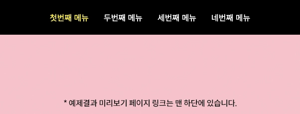
<li><a href="#sec1">첫번째 메뉴</a></li>
<li><a href="#sec2">두번째 메뉴</a></li>
<li><a href="#sec3">세번째 메뉴</a></li>
<li><a href="#sec4">네번째 메뉴</a></li>
</ul>
</header>
<section class="section" id="sec1"></section>
<section class="section" id="sec2"></section>
<section class="section" id="sec3"></section>
<section class="section" id="sec4"></section>
<footer></footer>
|
헤더 및 메뉴
- <header> 태그 안에 위치한 클래스 menu의 <ul> 요소는 페이지의 각 섹션으로 이동할 수 있는 내비게이션 링크를 포함합니다.
- 각 <li> 항목은 특정 섹션(#sec1, #sec2 등)으로 이동하는 하이퍼링크를 포함합니다.
섹션
- 각 <section> 요소는 웹 페이지의 주요 콘텐츠 부분을 나타내며, 고유한 ID(id=“sec1”, id=“sec2” 등)를 가집니다.
푸터
- <footer> 태그는 페이지의 하단 영역을 나타냅니다.
CSS 스타일
 1
 2
 3
 4
 5
 6
 7
 8
 9
10
11
12
13
14
15
16
17
18
| body {padding-top: 70px;}
header {position: fixed;top: 0;left: 0;width: 100%;background: #000;z-index: 1;}
.menu {display: flex;justify-content: center;}
.menu > li {list-style: none;}
.menu > li a {display: flex;align-items: center;height: 70px;padding: 0 15px;font-size: 16px;color: #fff;text-decoration: none;}
.menu > li.active a {color: #fff000;}
.section {height: calc(100vh - 70px);}
#sec1 {background: #FFC0CB;}
#sec2 {background: #FFE4E1;}
#sec3 {background: #FFF6D3;}
#sec4 {background: #AEEEEE;}
footer {height: 300px;background: #000;}
@media (max-width: 600px) {
body { padding-top: 50px; }
.menu > li a {font-size: 14px;height: 50px;padding: 0 10px;}
.section {height: calc(100vh - 50px);}
}
|
기본 레이아웃
- body에 padding-top을 적용하여 헤더와 콘텐츠 간 충돌을 방지합니다.
- header는 고정되어 있어 페이지 스크롤 시에도 항상 보이게 합니다.
반응형 디자인
- @media 쿼리를 사용하여 화면 크기가 600px 이하일 때 메뉴와 섹션의 크기와 스타일을 조정합니다.
메뉴 및 섹션 스타일링
- 메뉴 링크는 유연한 디자인을 위해 flex를 사용합니다.
- 각 섹션은 다른 배경 색상을 가지며, 화면 높이에 맞춰 조정됩니다.
jQuery 코드
  1
  2
  3
  4
  5
  6
  7
  8
  9
 10
 11
 12
 13
 14
 15
 16
 17
 18
 19
 20
 21
 22
 23
 24
 25
 26
 27
 28
 29
 30
 31
 32
 33
 34
 35
 36
 37
 38
 39
 40
 41
 42
 43
 44
 45
 46
 47
 48
 49
 50
 51
 52
 53
 54
 55
 56
 57
 58
 59
 60
 61
 62
 63
 64
 65
 66
 67
 68
 69
 70
 71
 72
 73
 74
 75
 76
 77
 78
 79
 80
 81
 82
 83
 84
 85
 86
 87
 88
 89
 90
 91
 92
 93
 94
 95
 96
 97
 98
 99
100
101
102
103
104
105
106
107
108
109
110
111
112
113
114
115
116
117
| $(window).on('load', function () {
fullPage();
});
function fullPage() {
let currentSection = 0;
const $sections = $('.section'); // 모든 섹션 요소
const $menu = $('.menu > li'); // 메뉴 항목
const $footer = $('footer'); // 페이지 하단 영역
let menuHeight = $('header').height(); // 상단 메뉴 높이
let isScrolling = false; // 스크롤 중 여부를 나타내는 플래그
let isWindowSizeValid = false; // 윈도우 크기 유효 여부를 나타내는 플래그
const numSections = $sections.length; // 섹션의 개수
//메뉴 클릭 이벤트 핸들러
function clickHandler(e, targetSectionIndex) {
e.preventDefault();
const offset = $sections.eq(targetSectionIndex).offset().top;
currentSection = targetSectionIndex;
// 해당 섹션으로 스크롤 이동
$('html,body').animate({ scrollTop: offset - menuHeight }, 500);
}
// 섹션 스크롤 함수
function scrollToSection(sectionIndex) {
const targetPosition = sectionIndex === numSections ? $footer.offset().top : $sections.eq(sectionIndex).offset().top;
//특정 섹션으로 스크롤 이동
$('html, body').animate({
scrollTop: targetPosition - menuHeight
}, 500, function () {
isScrolling = false;
});
}
// 윈도우 크기 확인 함수
function checkWindowSize() {
const windowWidth = window.innerWidth;
const windowHeight = window.innerHeight;
isWindowSizeValid = windowWidth > 767 && windowHeight > 700;
menuHeight = $('header').height();
}
// 초기 윈도우 크기 확인
checkWindowSize();
// 윈도우 크기 변경 시 윈도우 크기 확인
$(window).on('resize', checkWindowSize);
// 스크롤 이벤트 핸들러
function handleScroll(e) {
if (!isWindowSizeValid || isScrolling) return;
isScrolling = true;
// 스크롤 방향에 따라 섹션 인덱스 변경
if (e.originalEvent.deltaY < 0 && currentSection > 0) {
currentSection--;
} else if (e.originalEvent.deltaY > 0 && currentSection < numSections - 1) {
currentSection++;
} else if (e.originalEvent.deltaY > 0 && $footer.offset().top - $(window).scrollTop() <= window.innerHeight) {
currentSection = numSections;
}
scrollToSection(currentSection);
}
// 메뉴 클릭 이벤트 핸들러
$menu.children('a').on('click', function (e) {
const targetSectionIndex = $sections.index($($(this).attr('href')));
clickHandler(e, targetSectionIndex);
});
// 마우스 휠 이벤트 핸들러
$(window).on('wheel', handleScroll);
// 터치 이벤트 핸들러
let touchStartY = 0;
$(window).on('touchstart', function (e) {
if (!isWindowSizeValid || isScrolling) return;
touchStartY = e.originalEvent.touches[0].clientY;
});
$(window).on('touchmove', function (e) {
if (!isWindowSizeValid || isScrolling) return;
const currentY = e.originalEvent.touches[0].clientY;
const deltaY = currentY - touchStartY;
// 터치 방향에 따라 섹션 인덱스 변경
if (deltaY < 0 && currentSection < numSections) {
currentSection++;
} else if (deltaY > 0 && $footer.offset().top - $(window).scrollTop() <= window.innerHeight) {
currentSection--;
} else if (deltaY > 0 && currentSection > 0) {
currentSection--;
}
scrollToSection(currentSection);
isScrolling = true;
});
$(window).on('touchend', function () {
if (!isWindowSizeValid) return;
isScrolling = false;
});
// 스크롤 이벤트 핸들러를 통해 활성 메뉴 업데이트
$(window).scroll(function(){
let scltop = $(window).scrollTop() + menuHeight;
$.each($sections, function(idx, item){
let targetTop = $(this).offset().top;
if (targetTop <= scltop) {
$menu.removeClass('active');
$menu.eq(idx).addClass('active');
}
})
if (Math.round( $(window).scrollTop()) == $(document).height() - $(window).height()) {
$menu.last().addClass('active').siblings().removeClass('active');
}
}).scroll();
}
|
초기화 및 변수 선언
- 페이지 로드 시 fullPage() 함수가 호출되어 초기화를 수행합니다.
- currentSection : 현재 활성화된 섹션의 인덱스를 추적합니다.
- $sections : 모든 .section 요소를 선택하여 저장합니다.
- $menu : 메뉴 항목(.menu > li)을 선택합니다.
- $footer : $(‘footer’)를 통해 페이지 하단 영역을 선택합니다.
- menuHeight : 상단 메뉴의 높이를 저장합니다.
- isScrolling : 스크롤 중인지를 나타내는 플래그입니다.
- isWindowSizeValid : 윈도우 크기가 유효한지를 나타내는 플래그입니다.
- numSections : 섹션의 총 개수를 저장합니다.
메뉴 클릭 이벤트 핸들러
- 메뉴 항목 클릭 시, 해당 섹션으로 스크롤 되도록 clickHandler 함수가 정의되어 있습니다.
- 클릭 된 섹션의 오프셋을 계산하여 스크롤 애니메이션을 적용합니다.
스크롤 이벤트 핸들러
- 마우스 휠 또는 터치 이벤트에 의해 발생하는 스크롤을 처리합니다.
- 스크롤 방향에 따라 currentSection 인덱스를 적절히 증감시킵니다.
- 스크롤이 발생할 때마다 해당 섹션으로 부드럽게 이동합니다.
터치 이벤트 핸들러
- 터치 시작(touchstart)과 이동(touchmove) 이벤트를 처리합니다.
- 터치 방향에 따라 적절한 섹션으로 스크롤 합니다.
윈도우 크기 변경 감지
- 윈도우 크기가 변경될 때마다 checkWindowSize 함수를 호출하여 메뉴 높이와 윈도우 크기 유효성을 재계산합니다.
스크롤 위치에 따른 메뉴 활성화
- 스크롤 이벤트 발생 시, 현재 스크롤 위치에 따라 해당하는 메뉴 항목을 활성화합니다.
- 이는 사용자가 어느 섹션에 있는지 시각적으로 나타내주는 중요한 기능입니다.
결론
이 예제를 통해 우리는 jQuery를 사용하여 효과적이고 매끄러운 풀페이지 스크롤 기능을 구현하는 방법을 탐색했습니다. fullpage.js와 같은 외부 라이브러리에 의존하지 않으면서도 사용자에게 직관적이고 쾌적한 스크롤 경험을 제공합니다. 이러한 접근법은 웹 개발자가 페이지 내비게이션과 상호작용을 개선하고, 다양한 디바이스와 화면 크기에 대응하는 반응형 웹 디자인을 구현하는 데 큰 도움이 됩니다.
또한, 동적인 웹사이트 인터랙션을 구현하는 방법을 보여주는 좋은 사례입니다. 스크롤 이벤트, 터치 이벤트, 윈도우 크기 변화에 반응하는 로직은 사용자 경험을 개선하고, 웹사이트의 접근성을 높이는 데 중요한 역할을 합니다.